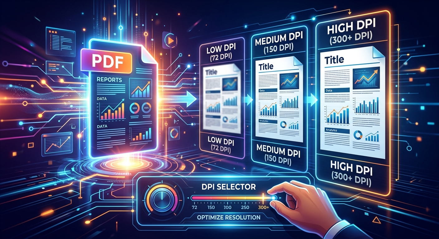
You convert a PDF to an image, send it off, and the complaint comes back: "The text looks blurry" or "This file is too big to email." Nine times out of ten, the problem is DPI. It's a setting most people skip over, but it controls everything from image sharpness to file size. Pick the wrong number and you're either sending a pixelated mess or a file that takes forever to upload. Pick the right one and the output is clean, usable, and exactly the size you need.
Resolution at a Glance
- 72 DPI is enough for images viewed on screens or shared on the web
- 150 to 200 DPI gives OCR software the clarity it needs to read text accurately
- 300 DPI is the accepted minimum for printing documents
- Higher DPI always means a larger file size, so matching DPI to purpose avoids waste
- Setting DPI at conversion time is easier and more reliable than trying to resize afterward
What DPI Actually Means in Plain Terms
DPI stands for dots per inch. In the context of converting a PDF to an image, it describes how many pixels get packed into each inch of the output file. A higher DPI means more pixels, more detail, and a sharper image. It also means a bigger file.
Here is where people get confused. A PDF is a vector-based format. It stores text, shapes, and graphics as mathematical descriptions, not pixels. That means a PDF can be scaled to any size without looking blurry. When you convert it to a JPEG or PNG, you are essentially baking those descriptions into a fixed pixel grid. The DPI you choose at that moment determines how dense that grid will be.
Think of it like this. Imagine a printed page photographed with a low-resolution camera. The letters look rough around the edges and the fine lines blur together. That degradation is exactly what happens when you convert a PDF at too low a DPI. You started with crisp vector data and turned it into a low-quality image that cannot be recovered without re-converting from the original file.
Why Getting DPI Wrong Creates Bigger Headaches Than You Expect
Set DPI too low and the output image looks soft or pixelated. Characters run together. Fine lines and thin borders disappear entirely. Any OCR software you run on the image will struggle, because it relies on clear letterforms to recognize text. Errors in automated text extraction can cascade into data problems you have to clean up by hand.
Set DPI too high and you waste storage space, slow down email delivery, and sometimes freeze the application that tries to open the file. A single page converted at 600 DPI can easily reach 10 MB or more. Multiply that across a 20-page report and you have a serious problem for anyone on a slow connection or with limited inbox storage.
The goal is never the highest DPI possible. The goal is the right DPI for how the image will actually be used.
Screen Display: Why a Lower Number Is Perfectly Fine
Most monitors display content at between 72 and 96 pixels per inch. Your screen physically cannot show the extra detail packed into a 300 DPI image. It scales the image down, and you end up with a large file that looks identical to a much smaller one.
For anything that lives on a website, a slide deck, or a shared internal document viewed on screen, 72 to 96 DPI is the sensible choice. The image stays sharp for its purpose, the file stays small, and nobody notices any quality difference. If you are generating thumbnail previews of PDF pages for a content management system or an internal wiki, this is the setting that keeps page loads fast without any visible penalty.
Email Attachments: Finding the Balance Between Clarity and Size
Email occupies a middle ground. The person receiving your attachment might print it or just read it on their laptop. A conversion in the 100 to 150 DPI range typically hits the right balance. Text stays readable, charts stay legible, and the file stays under the size limits most mail servers enforce.
A practical test: after converting, open the image at 100% zoom in any image viewer and read a line of standard body text. If you can read it without straining, the DPI is sufficient. If letters look jagged or merged at the edges, nudge the setting up by 25 or 50 and test again.
OCR Workflows: Where Resolution Directly Affects Accuracy
Optical character recognition software reads pixels. It maps pixel shapes to known letterforms in its character database. When those pixels are too few or too spread apart, the software starts guessing. Guesses become character substitutions. Character substitutions turn into data entry errors you have to track down and correct manually.
Institutions with formal digitization programs set the bar high for exactly this reason. The Library of Congress publishes thorough digital preservation standards for scanned documents, with recommended minimums starting at 300 DPI for text-heavy materials and higher for documents with small fonts or fine detail.
For routine office OCR tasks like digitizing invoices or extracting data from scanned forms, 150 to 200 DPI works well. For receipts with small print, handwritten annotations, or densely formatted tables, 300 DPI is the safer call. The file will be larger, but the accuracy gain is worth it. You will spend less time correcting output than you would at a lower setting.
Print Output: The 300 DPI Standard That Professionals Rely On
Print is unforgiving in a way screens are not. A setting that looks acceptable on a monitor can produce noticeably soft output on paper. Professional printers, copy shops, and standard office laser printing all benefit from a minimum of 300 DPI.
At 300 DPI, a standard US letter-size page (8.5 by 11 inches) produces an image 2,550 by 3,300 pixels. That density gives inkjet and laser printers enough data to render crisp text and sharp edges at full page size. Drop below 200 DPI and you will see visible softness in small font sizes and thin horizontal rules.
If you are preparing documents for a professional print shop, check their specification sheet before converting. Some workflows require 400 DPI. High-quality photo content embedded in a document may need even more. For standard office printing, though, 300 DPI covers the vast majority of real-world use cases without creating unmanageable file sizes.
How to Convert a PDF With the Correct DPI Setting
Choosing the right DPI only helps if your conversion tool actually lets you set it. Many basic online converters apply a fixed resolution without telling you what it is. The following process gives you control over the output from the start:
- Decide on your end use before opening any tool. Screen display, email, OCR, or print? That decision drives everything else, including both DPI and format choice.
- Use a conversion tool that exposes resolution settings. A tool like the PDF to JPG converter lets you configure output settings before processing, which saves you from quality surprises after the fact.
- Enter your target DPI based on the use case. Use 72 to 96 for screen, 100 to 150 for email, 150 to 200 for OCR, and 300 for print.
- Convert a single page first. Open it at 100% zoom and examine the text quality before processing the full document.
- Check the file size of that test page. If it exceeds any attachment or upload limit, reduce DPI by one step and test again.
- Process the full document once you are satisfied. Do not skip the single-page test, especially on long documents.
That test-first step prevents a frustrating amount of wasted time. Re-converting a 50-page PDF because the resolution was wrong is avoidable with two minutes of checking upfront.
DPI and File Format Work Together
DPI does not exist in isolation. The file format you choose at conversion time affects how resolution plays out in practice, and the two decisions reinforce each other.
JPEG applies compression after setting the pixel grid. A 300 DPI JPEG at high quality looks sharp and stays at a manageable file size, making it a practical choice for most office and admin workflows. PNG uses lossless compression, so it retains every pixel without degradation, but will produce a noticeably larger file at the same DPI. TIFF files, common in professional scanning and archival OCR workflows, preserve the full resolution without any compression artifacts at all.
For the majority of conversion tasks, JPEG at 300 DPI covers both print and OCR needs well. PNG is worth using when you need transparency or plan to edit the image in a graphics application afterward. TIFF makes the most sense for long-term archival storage or any workflow that requires zero compression loss. Getting both DPI and format right together means the output file is fit for its purpose from the moment it lands in your downloads folder.
Your DPI Reference for Every Use Case
DPI Settings by Output Purpose
| Use Case | Recommended DPI | Why It Works |
|---|---|---|
| Web or screen display | 72 to 96 DPI | Matches monitor pixel density; extra detail is invisible and just adds file weight |
| Email attachments | 100 to 150 DPI | Legible on screen, lightweight enough to clear most mail server size limits |
| OCR and text extraction | 150 to 300 DPI | Provides enough pixel data for character recognition software to read accurately |
| Standard office printing | 300 DPI | Industry-standard minimum for sharp printed text and clean edges |
| Professional or archival print | 400 DPI or higher | Required by some print shops and archival standards for fine detail reproduction |
The Setting That Determines Whether Your Document Lands or Falls Flat
DPI is not a setting you choose once and forget. Every time you convert a PDF to an image, you are making a decision about how that document will be used. Screen viewing needs one number. OCR needs another. Print needs a third. None of them are arbitrary.
Getting the setting right before you convert saves you from re-doing the work. It keeps your files at a sensible size without sacrificing readability. It means the person receiving your document does not have to squint at blurred text or wait for an oversized file to finish downloading.
The table above is your reference. The next time you open a conversion tool, take five seconds to match your DPI to your purpose. Your output will be sharper, your files will be leaner, and the complaints about blurry images will stop.